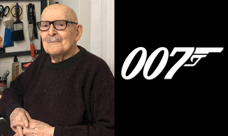
Joseph Caroff, the graphic designer behind James Bond’s legendary 007 logo, passes away at 103.
ENTERTAINMENT


The legendary graphic designer, best known for creating the iconic James Bond 007 logo, passed away peacefully on Sunday, just a day before what would have been his 104th birthday. His death marks the end of a remarkable era in design, as he leaves behind a legacy that shaped not only the world of cinema but also modern visual culture.
The Man Who Drew the Gun in “007”
Joseph Caroff, known to many simply as Joe Caroff, passed away on August 17, 2025 — just one day shy of what would have been his 104th birthday. (Wikipedia) While his name might not have been a household catchphrase, his work certainly is: he designed the instantly iconic 007 pistol logo — the artful fusion of the digits “007” and a gun barrel, the mark that has come to symbolise espionage, style, danger, and intrigue. (The Guardian)
Caroff’s journey into design didn’t start in the limelight. Born in 1921 in New Jersey to immigrant parents, he studied at the Pratt Institute in Brooklyn, and went on to carve out a long career in graphics, branding, and film poster work. (Wikipedia) His portfolio spans more than 300 film campaigns — among them West Side Story, A Hard Day’s Night, Cabaret, Manhattan, Last Tango in Paris, and Gandhi. (The Guardian) He also designed opening title sequences (for films such as A Bridge Too Far and The Last Temptation of Christ) and created logos and visual identities outside of cinema. (The Guardian)
How 007 Became a Logo
The story goes that Caroff was originally commissioned in 1962 to create a letterhead graphic for a publicity release for Dr. No, the first Bond film. (The Guardian) As he jotted down “007,” he saw in the tail of the “7” a pistol’s grip, and the idea struck him: integrate a barrel and trigger and the logo was born. (The Guardian) That creative flash — an almost offhand moment of insight — turned into a visual identity that has endured, with some small modifications, across decades of films, posters, merchandise, and expanded Bond media. (Daring Fireball)
Yet the irony is that Caroff was paid a modest USD 300 for that design and was never credited publicly for it, nor did he receive royalties as Bond grew into a global franchise. (The Guardian) Over the years, fans of design and film gradually rediscovered his contribution, and today his name is more recognised in design circles. (Design Week)
Legacy Beyond 007
It’s tempting to let his Bond logo alone define his legacy — after all, few marks are so instantly legible across languages and cultures. But Joe Caroff’s artistry goes deeper when you look at his body of work.
Take his West Side Story poster: the familiar fire-escape silhouettes in lettering, dancers perched on scaffolding — a clever blending of typography and imagery that gave the poster its emotional strut. (Design Week) Or his Manhattan poster, in which the skyline itself forms letters — subtly clever, visually precise. (The Guardian)
Caroff was known among peers for striving for what he called “effervescence” in his designs — work that had life, energy, a spark rather than lying flat. (The Guardian) He wasn’t about endless iterations; he believed that if a concept didn’t “pop up” relatively quickly, perhaps it was not worth forcing. (The Guardian)
Though his name may not have been as celebrated as contemporaries like Saul Bass during his lifetime, in recent years a biographical documentary (By Design: The Joe Caroff Story, 2022) helped introduce new audiences to his craft and impact. (The Guardian) On his 100th birthday, Bond producers even honored him with a 007-engraved Omega watch. (The Independent)
A Personal Reflection: Why Caroff’s Story Resonates
I find Caroff’s story both inspiring and bittersweet. On one hand, his ability to hit on a simple, timeless design with that “007 gun” brand mark is a masterclass in visual thinking. It’s the kind of creative stroke many of us in design or art dream of — the kind of idea that feels inevitable once revealed. The fact that he saw that so spontaneously — just by noticing a shape in the tail of the “7” — is a reminder that being alert, observant, and willing to trust intuition is often as important as technique.
On the other hand, it’s sobering that such a culturally consequential design brought so little direct financial or recognition reward to its creator. So many creators in advertising, design, film — the people behind the scenes — make work that becomes iconic, yet remain invisible to the broader public. Caroff’s life underscores how the systems around crediting, royalties, publicity, and contracts can undervalue the very minds who shape our visual world.
Given the way Caroff approached his craft — quietly, diligently, often anonymously — I feel a kind of admiration for his humility. He didn’t chase fame; he didn’t plaster his signature everywhere. Yet his work has outlasted many flashier names. In a way, that’s a triumph of substance over self-promotion.
If there’s a lesson for young designers or visual storytellers today, it’s this: be bold in your ideas, but honour your worth. Document your work, negotiate credit where possible, and tell your story. The world may not always notice immediately, but shapes and symbols persist.
In Memoriam
As Joseph Caroff fades into history, his creations remain very much alive. Every time we see those sinuous “007” letters, we’re engaging — perhaps unconsciously — with his visual legacy. In film lobbies, on posters, in video game menus, in merchandise, the mark still carries meaning, edge, sophistication. In that sense, Joe Caroff is not gone. He is still drawing, still influencing, still present in the curves and negative space.
May his memory encourage more recognition for the quiet creatives, the anonymous hands behind the scenes, whose invisible strokes shape how we see stories, brands, and dreams.
